Visual Identity
Visual Identity System
Visual Identity System
Visual Identity System
Visual Identity System
With a wide product offerings and a marketing presence that didn't always align, Toyota needed to curb vehicle missattribution to stand apart from competitors.
By uniting all products as a team of brands, we were able to establish a new visual language and elevate the design system while remaining unmistakably Toyota.
Project
With a wide product offering and a marketing presence that didnt always align, Toyota needed to curb vehicle missattribution to stand apart from competitors.
In addition to a custom typeface and an identity refresh, we established a new visual language and design system that elevated the brand while remaining unmistakably Toyota.

Logo Usage
Our approach was to enhance awareness by comunicating more clearly and quickly. By setting our emblem in a foundation of the brand color, we can help it stand out while also protecting it against busy backgrounds. Within the parameters of the system, the wordmark, product names, subrands, and "Let's Go Places" tagline can be interchangable based on the message.
Logo Usage
Our approach was to elevate awareness by drawing the eye to the the logo. By setting our emblem in a foundation of the brand color, we could help it to stand out while also protecting it against busy backgrounds. Within the parameters of the system the wordmark can be replaced with product names, subrands, as well as our "Let's Go Places" tagline.
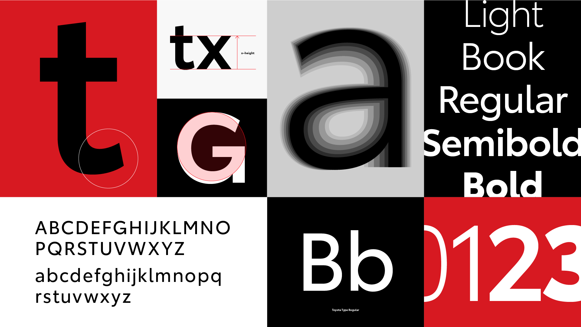
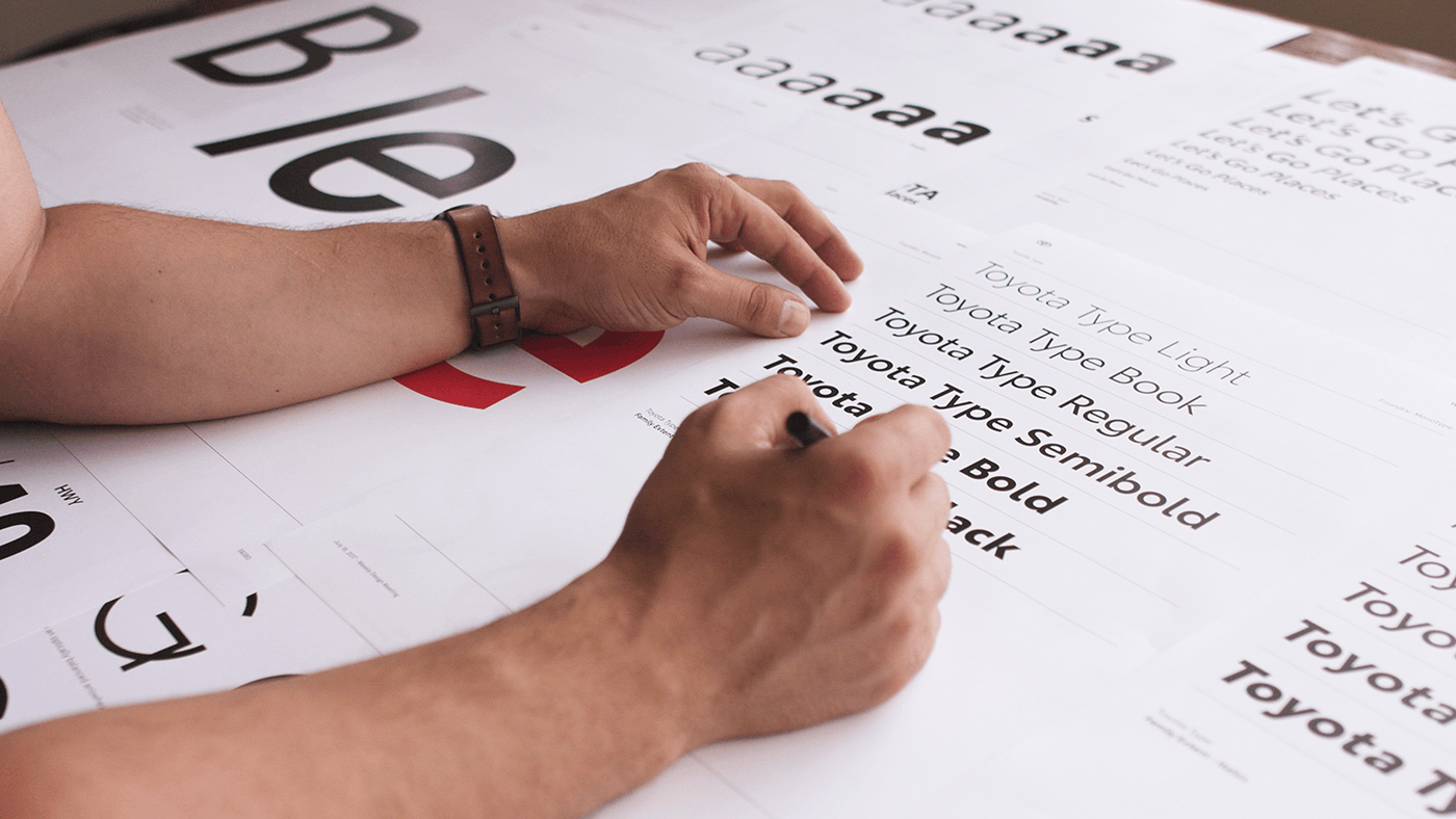
Working with our partners at Monotype, we created a custom typeface that speaks in the Toyota tone of voice.
Working with our partners at Monotype, we created a custom typeface that speaks in the Toyota voice.
Working with our partners at Monotype, we created a custom typeface that speaks in the Toyota voice.
Working with our partners at Monotype, we created a custom typeface that speaks in the Toyota voice.
Working with our partners at Monotype, we created a custom typeface that speaks in the Toyota voice.
Toyota Type
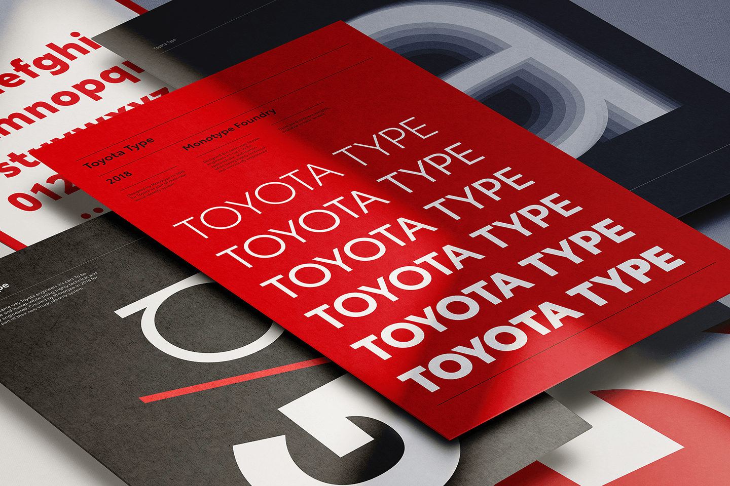
The typography is where more functional communication meets with the emotion of our story telling. A geometric sans serif typeface was designed to be approachable, complimenting the wordmark and brand tone of voice. Toyota type will standardize the look across materials, while still allowing a range of expression for the unique personalities of the product range.
Toyota Type
A geometric sans serif typeface was designed to help standardize the look across materials while still allowing a range of expression for the unique personalities of the product range. The typography is where the emotion of our stories meet with functional information.
Toyota Type
A geometric sans serif typeface was designed to help standardize the look across materials while still allowing a range of expression for the unique personalities of the product range. The typography is where the emotion of our stories meet with functional information.
Toyota Type
A geometric sans serif typeface was designed to help standardize the look across materials while still allowing a range of expression for the unique personalities of the product range. The typography is where the emotion of our stories meet with functional information.
Design System
The message needed to be clear in our marketing. So we simplified it, and removed the clutter of information. By visually anchoring the model name to the Toyota emblem, we made sure that the product story remains the hero and links directly to the brand.
Design System
The message needed to be clear in our marketing. So we simplified it, and removed the clutter of information. By visually anchoring the vehicle name to the Toyota logo, we made sure that the product story was the hero. As well as linking products directly back to the brand.
Design System
The message needed to be clear in our marketing. So we simplified it, and removed the clutter of information. By visually anchoring the vehicle name to the Toyota logo, we made sure that the product story was the hero. As well as linking products directly back to the brand.
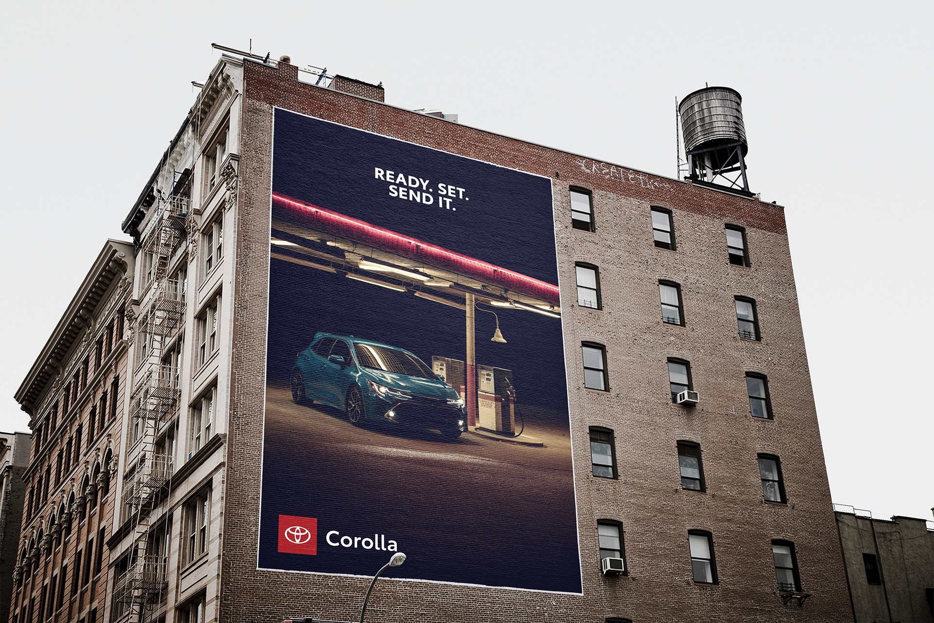
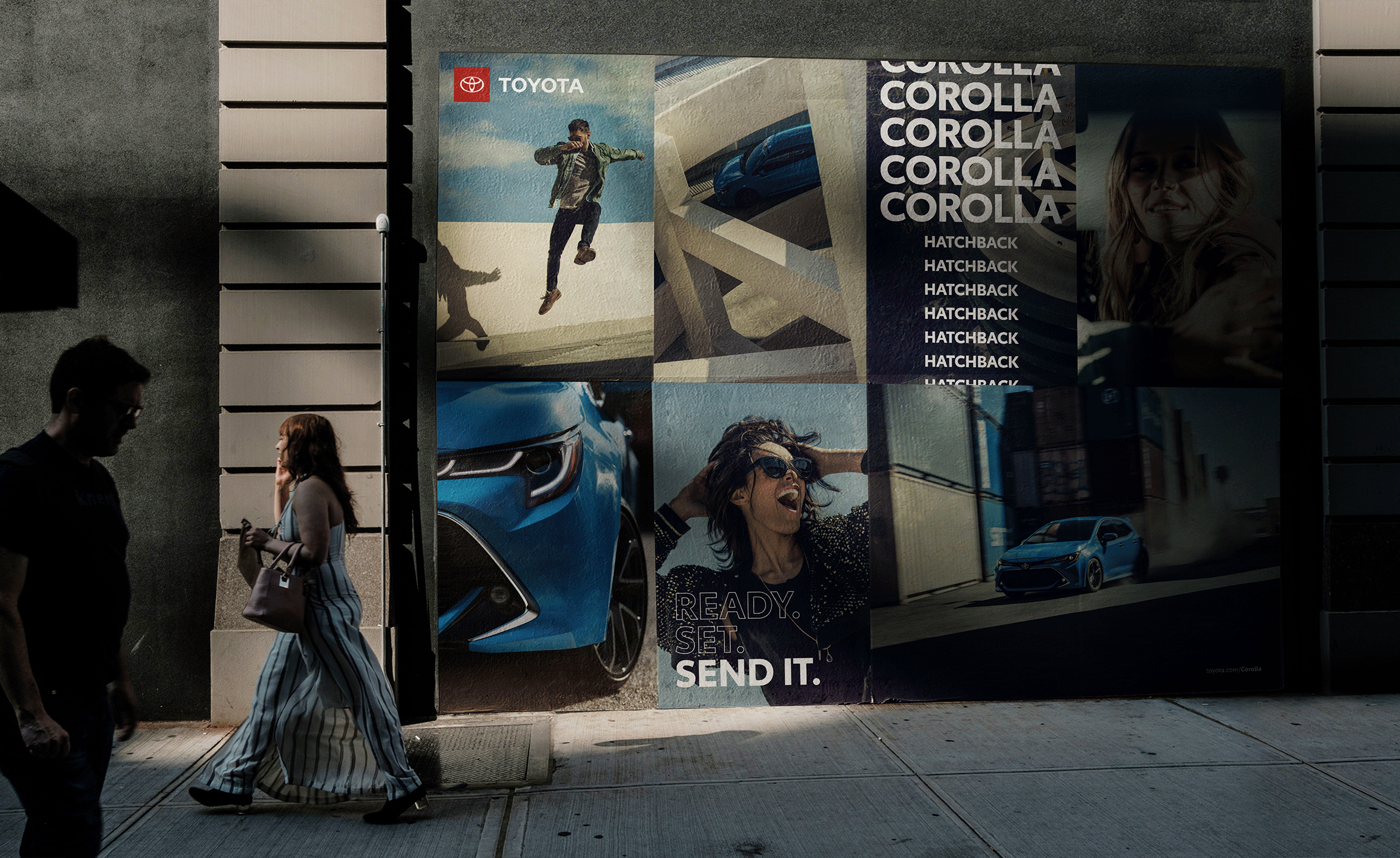
Photography & Cinematography
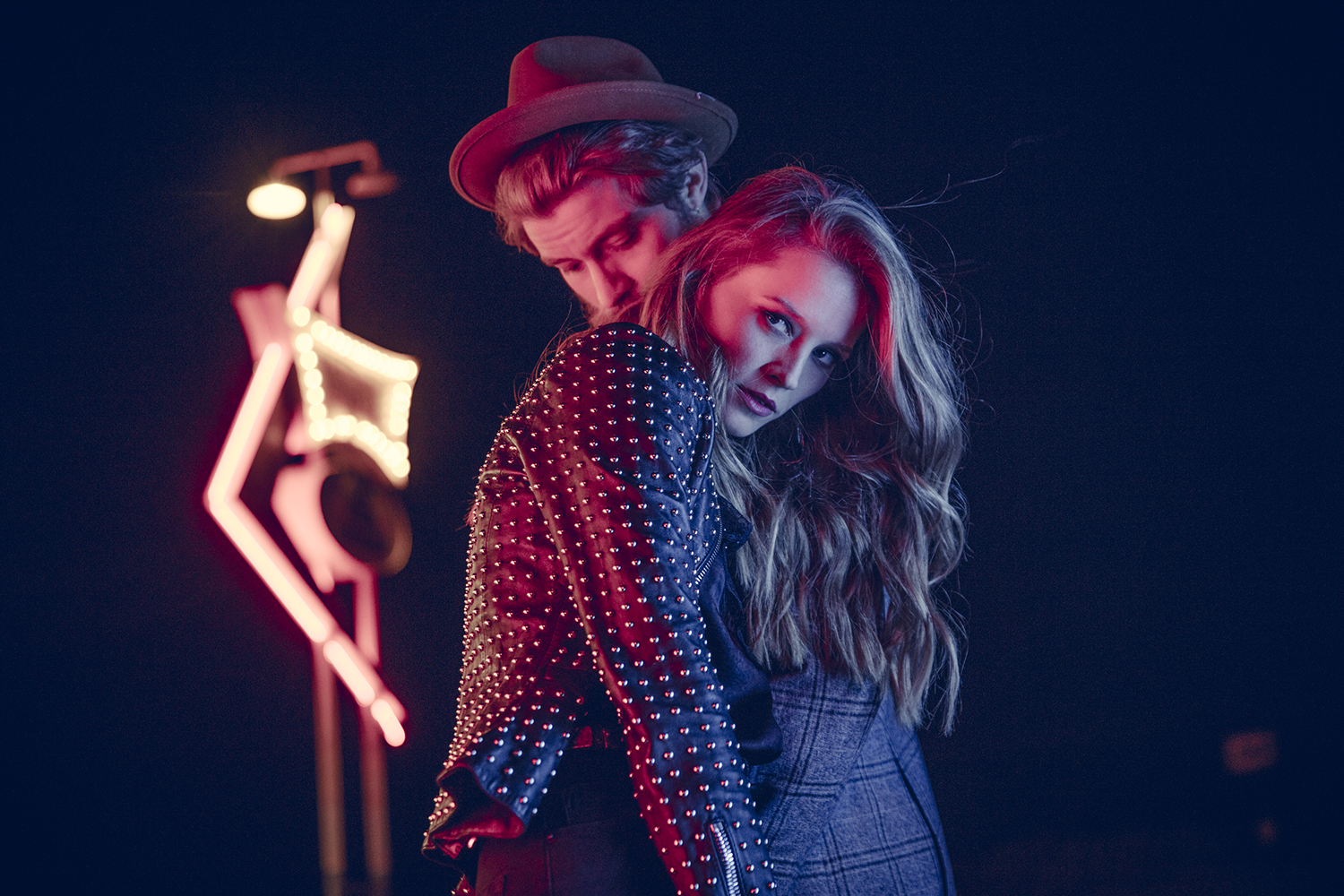
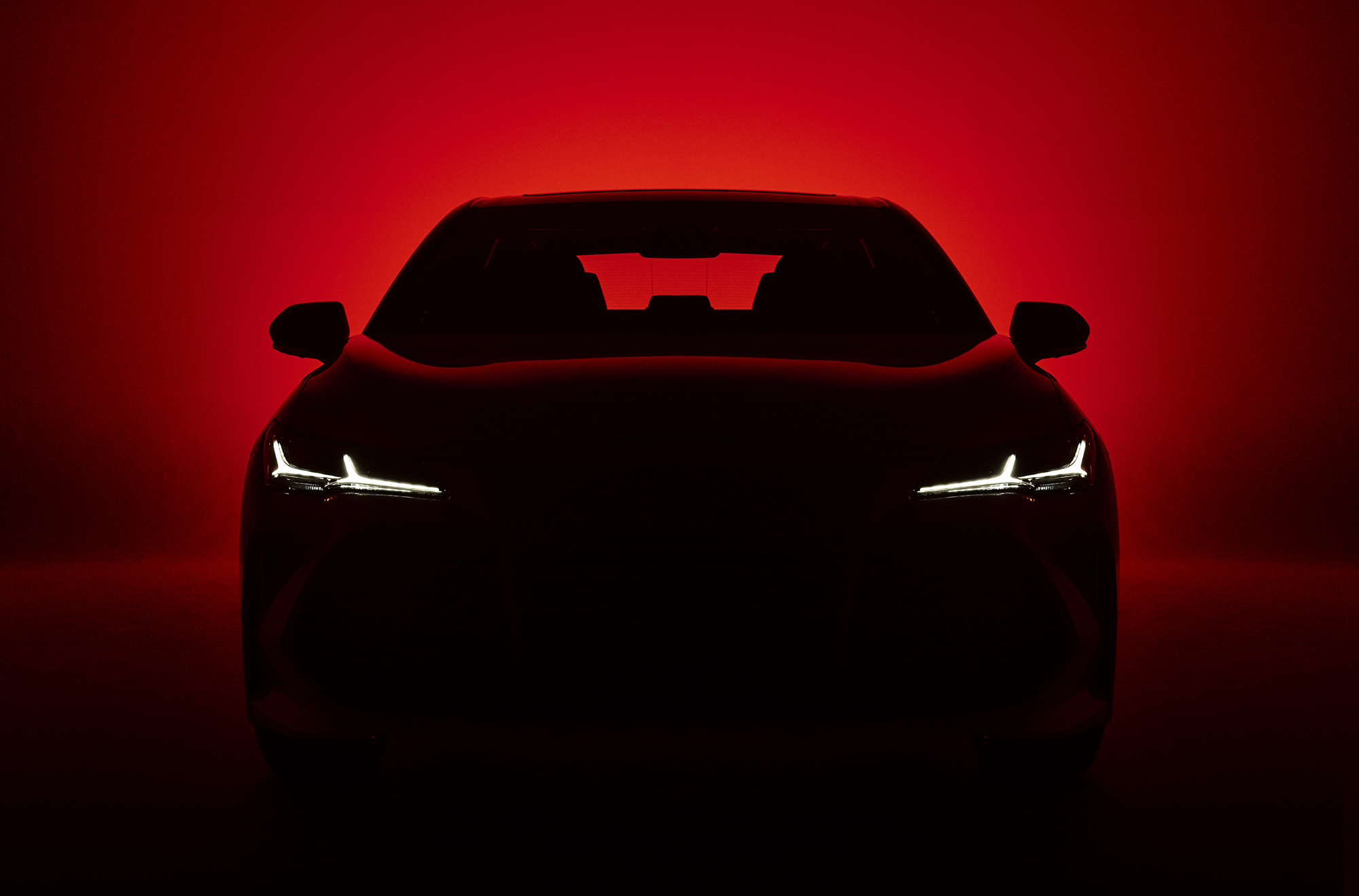
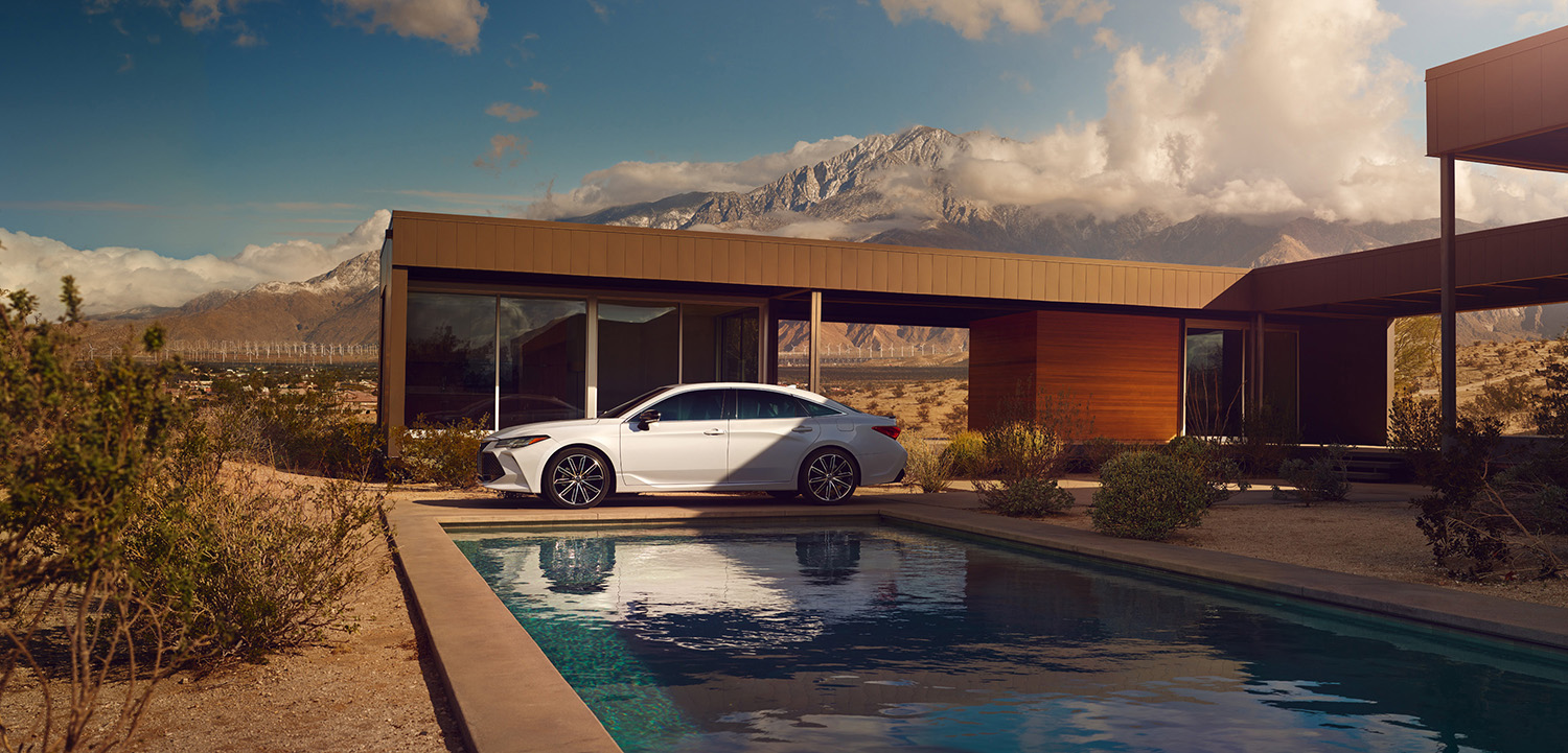
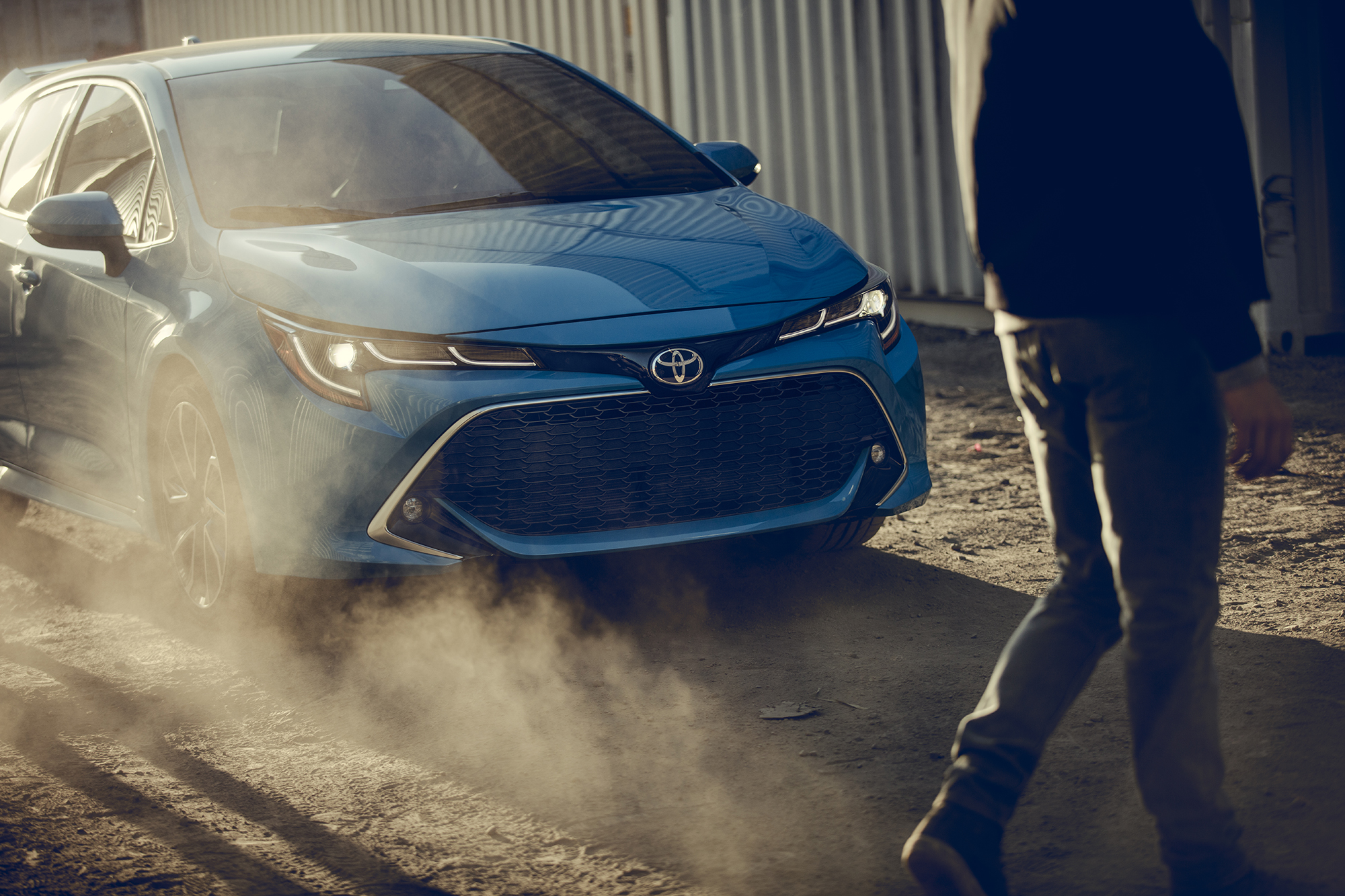
In addition to updating our design elements, our imagery needed a bit more excitement. We took a look at what we were doing right, and where we could inject more of the Waku-Doki spirit into how we share our product and brand story with consumers.
Photography & Cinematography
In addition to updating our design elements, our imagery needed a bit more excitement. We took a look at what we were doing right, and where we could inject more of the Waku-Doki spirit into how we share our product and brand story with consumers.
Photography & Cinematography
In addition to updating our design elements, our imagery needed a bit more excitement. We took a look at what we were doing right, and where we could inject more of the Waku-Doki spirit into how we share our product and brand story with consumers.
Photography & Cinematography
In addition to updating our design elements, our imagery needed a bit more excitement. We took a look at what we were doing right, and where we could inject more of the Waku-Doki spirit into how we share our product and brand story with consumers.
Photography & Cinematography
In addition to updating our design elements, our imagery needed a bit more excitement. We took a look at what we were doing right, and where we could inject more of the Waku-Doki spirit into how we share our product and brand story with consumers.
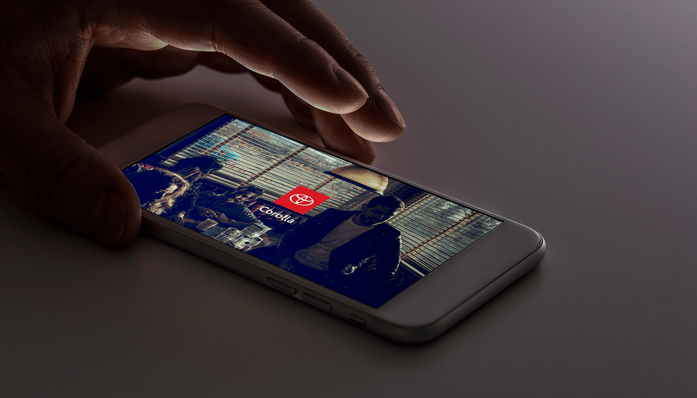
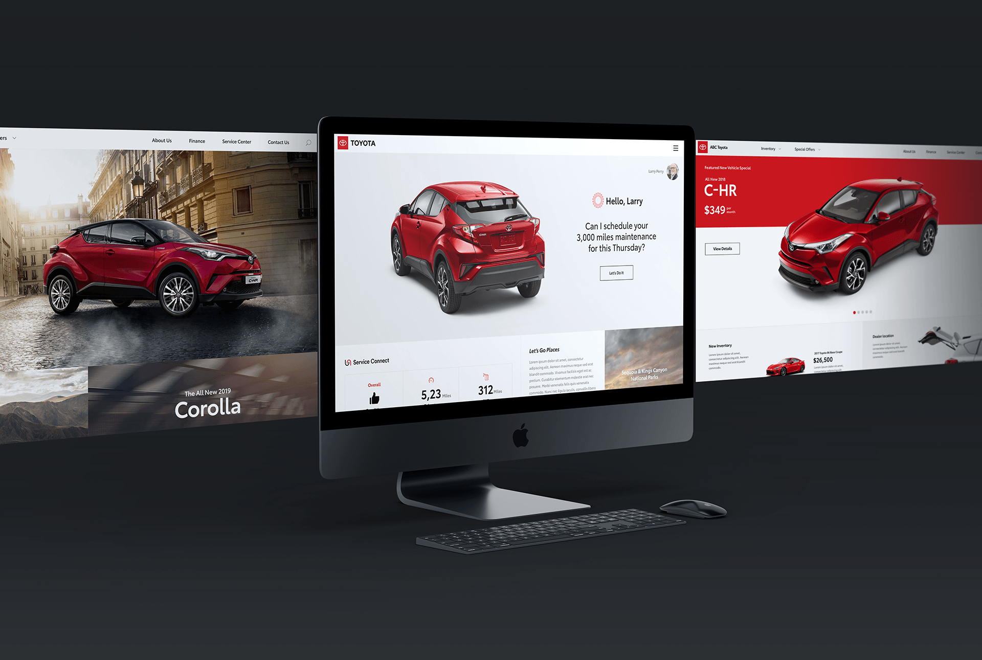
We explored how to unify our digital products at all touchpoints, down to local dealer level.
We explored how to unify our digital products at all touchpoints, down to the dealer level.
We explored how to unify our digital products at all touchpoints, down to the dealer level.
We explored how to unify our digital products at all touchpoints, down to the dealer level.
We explored how to unify our digital products at all touchpoints.
Role
Role
Brand Design
Visual Design
Role
Role
Role
Brand Design
Art Direction
Design Strategy
Role
Brand Design
Visual Design
Brand Design
Visual Design
Brand Design, Visual Design
Brand Design
Visual Design
Credits
Credits
Kenji Shimomura
Alejandro Larramendi
Doug Alves
Noopur Goel
Monotype
Credits
Credits
Credits
Kenji Shimomura
Doug Alves
Alejandro Larramendi
Credits
Kenji Shimomura
Alejandro Larramendi
Doug Alves
Noopur Goel
Monotype
Kenji Shimomura
Alejandro Larramendi
Doug Alves
Kenji Shimomura
Alejandro Larramendi
Doug Alves
Kenji Shimomura
Alejandro Larramendi
Noopur Goel
Monotype Foundry
Credits
Kenji Shimomura
Alejandro Larramendi
Doug Alves
Noopur Goel
Monotype
Noopur Goel
Monotype
Noopur Goel
Monotype
Doug Alves
Noopur Goel
Monotype
©2024 Jeremy Little. All rights reserved.
©2021 Jeremy Little. All rights reserved.
©2021 Jeremy Little. All rights reserved.
©2021 Jeremy Little. All rights reserved.
©2021 Jeremy Little. All rights reserved.